-
What’s the best way to move?
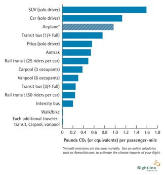
I find this figure from the Sightline Institute to be particularly helpful because it clearly demonstrates the most effective ways to reduce emissions for transportation. Too often, I think there are people motivated to do something about global warming, but they just don’t know how. The information is rarely easily accessible, and there are even times when people with the best intentions may actually be doing more harm than good.
For instance, I used to think that riding on planes emitted far more carbon than a car. I even made the decision once to make a long car trip instead of flying partially because I thought it was better for the environment. It turns out that if I had chosen to fly there would have been marginally less carbon in the atmosphere than there is now.
There are numerous examples where these charts are astoundingly helpful. I keep this seafood selector card in my pocket and have consulted WRI’s climate bill analysis multiple times. If there are other examples you have, please share them with me. I would love to see them.
With this figure though, I think there’s a quick take-home: Shorter distances are preferable to longer distances and (generally) the more people involved the better.
(Kudos to Gary Wagenbach for sharing this)
Categories
- Building and Planning
- Carleton's Wind Turbines
- Climate Change
- Conferences
- Cowling Arboretum
- Ecosystem Management
- Emissions and Offsets
- Energy Sources & Uses
- Environmental Justice
- Events
- Food
- Higher Education
- International News
- National News
- News
- STA Program
- Student Life
- Student Projects
- Sustainability
- Sustainable Planning & Development
- Transportation
- Waste