Student art shares space with professional prints in winter term Wellspring exhibition
Carleton art students reflect on their experiences stepping into the world of screen-printing for the winter term Wellspring exhibition.
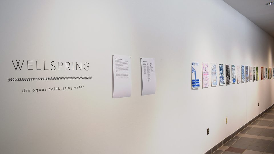
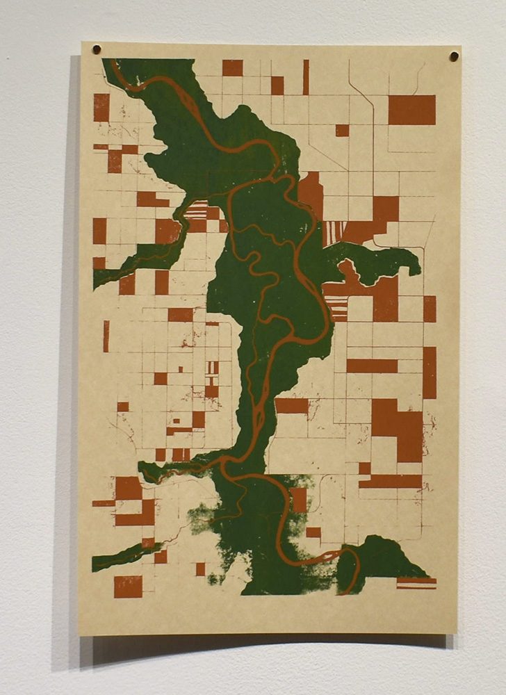
From Jan. 15 to March 1, Boliou Hall housed the combined efforts of professional and student artwork, displayed under the title “Wellspring.” Printmaking students of Professor Jade Hoyer ’07 produced their first multicolored screen-prints for the exhibition, taking inspiration from the artists of the Justseeds Artists’ Cooperative, who created a 12-piece portfolio celebrating water in 2016 that also featured in the Boliou exhibition.
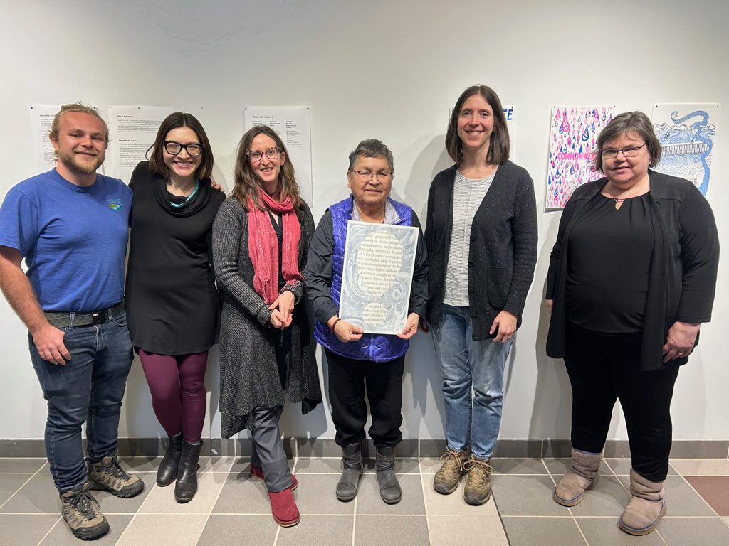
Wellspring had its official opening on Feb. 8, when L.A.-based environmental artist Sarita Zaleha, Ojibwe water walker Sharon Day, freshwater ecologist and professor Paula Furey and Clean River Partners Conservation Program Assistant Dane McKittrick spoke as part of a panel on the collection’s theme. During the panel, the intersection between printmaking and environmental ethics was publicly explored, and with it, an in-depth understanding of the ideas behind the works in the exhibition. The central message of the original Wellspring portfolio from Justseeds is the simple truth that “water is not a commodity but an inalienable right.” Furthermore, this inalienable right extends beyond humans to all life on earth: “Clean water is the birthright of all living beings, including those with four legs, fins, and leaves.”
These themes were rigorously investigated earlier in the term by Hoyer’s class through group reflections about the art and the messages tied to them. With the professional printers explicitly encouraging further “dialogue about this elemental issue,” Carleton students rose to the occasion, armed with ink and enthusiasm.
When first introduced to the idea, students were struck with the many possibilities before them. Miah Francis ’26 reflected, “I thought at first how open ended it could be and the very many ways and forms of water that pertain to everyone’s lives.”
Izzy Charlton ’23 shared this sentiment, saying, “I was very excited by the project proposal. Water is an essential part of all life, so I could see not only the importance of the project but the wide range of directions it could be taken.”
Actually interacting with Justseeds’ portfolio further inspired the student artists. Phi Rapacz ’24 marked the starting point of the creative process as the moment when students saw the works in person.
“Seeing the entire portfolio set some more gears turning,” she said. “I got a sense of the extant color and idea palette, and started thinking about what would interface well with them.”
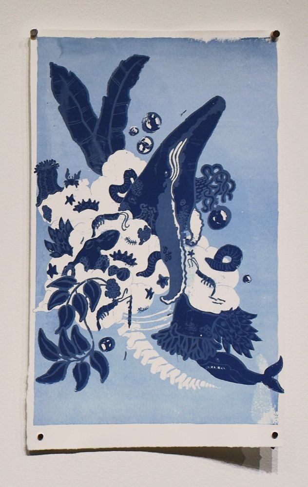
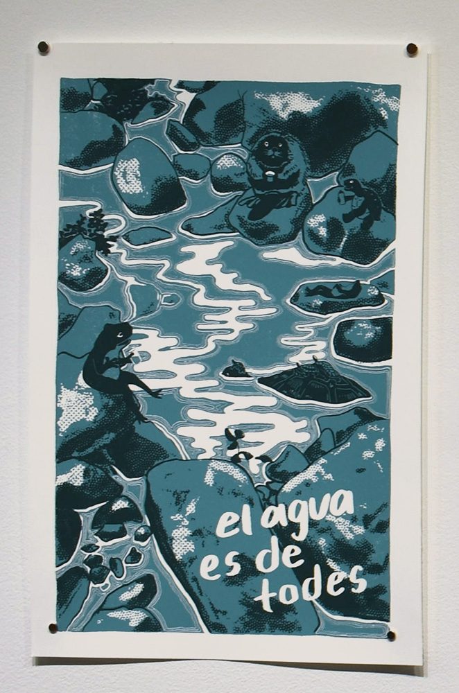
For many students, there was a singular piece that stood out above the rest: “Liminal” by Roger Peet, with its central iceberg and surrounding wildlife depicted in blue and green. “Liminal” had a special impact on Rapacz, who found it to be inspiring as the antithesis to her own work.
“Some of my first ideas were about deep ocean sea creatures,” she said, “and seeing that one helped me feel like some of that was covered in the portfolio already and I could go in a different direction.”
While Rapacz considered the portfolio a jumping-off point from which she leapt to completely new ideas, others found more direct inspiration in terms of techniques and ideas they hoped to replicate.
Francis appreciated the work of Thea Gahr, titled “Moon Within Moon Within Life,” as “the more you looked at it, the more details you noticed. That is what I tried to do with my own piece.”
Charlton similarly appreciated the idea of details layering together to impact the viewer.
“I particularly liked the beauty incorporated into these pieces,” she said. “The more I looked at them, the more details I noticed and the more thought-provoking the piece became. I wanted to capture that same spirit of having a beautiful print that draws your attention long enough to notice the more understated details.”
Ideation was an integral part of the process in polishing the rough compositions crafted by each student artist.
“Our group ideation session helped me find a road less traveled,” Rapacz said. “I guess I want everyone to feel like their work is unique, and making sure my own is unique helps with that.”
Francis further expressed the importance of a group ideation session where students were encouraged to reflect on and build off each other’s ideas, noting how “it helped to see what everyone else had thought of and where our ideas were similar and different.”
From the start of the project, with students sitting around the studio table sharing preliminary sketches, to final critique day, where finished prints hung on the walls, the variety in student work was apparent.
“I was shocked by the wide diversity of prints generated from the prompt,” Charlton said. “There was so much creativity coming from everybody, whether it was something more playful or more political. Each person really took something different out of the prompt and it was incredible to see it all come together into one portfolio. Each piece shone in its own way and communicated something very specific.”
Keeping in mind the rich history of printmaking in social justice movements, Charlton headed in the direction of utilizing printmaking “as a tool for social and political commentary. I wanted to be bold in my design and in the statement my art was making.” Many other students had similar ideas. Whether depicting the beauty of a whale fall or the despair of an isolated polar bear, the art of Wellspring strove to remind viewers of pertinent water issues.
In the brainstorming process, Charlton had many different ideas, but all of them circled back to the concept that water is a universal right for all living beings, not just humans. The ideation process brought this idea close to home for Charlton, connecting it to Minnesota specifically.
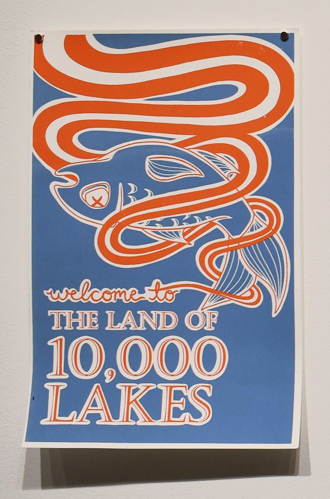
“The state’s 10,000 lakes are often seen as a recreational privilege rather than ecosystems that provide for so many living creatures,” she said. “In our commodification of these lakes, we are polluting them and making them uninhabitable.”
Coupling her own experience of witnessing how Minnesota’s “lakes have become a large commercial draw for recreation and tourism within the state” with “the graphic, visually striking style of advertisements,” Charlton’s work conveyed “the disturbing reality of our lakes.”
“Water recreation is a large part of Minnesotans’ lives,” Charlton said, “and I wanted to utilize that commercialization of Minnesota lakes in my commentary on water as a universal right.”
Rapacz also used her art to address a local water issue: the ownership of the Great Lakes.
“It’s a downer, I’m not going to lie,” said Rapacz. “I don’t think I can properly communicate how I felt when I learned that Nestlé has the water rights to the Great Lakes. My work is a threat, but it’s not a threat I made—it’s a threat I did my best to illustrate clearly and bluntly.”
Beyond drawing inspiration from local issues, experiences in the classroom itself played a role in shaping students’ focus. Francis shared how her history class focusing on U.S. consumerism culture drew her ideation process to center around the suburbanization and commercial use of water versus the natural use of water. As a biology major, Charlton found her view impacted by an ecological perspective—one of looking at the impact of humans on our natural surroundings—that she had acquired through her science classes.
Once students established their compositions, making their ideas a reality was another process entirely. While bringing varying levels of uncertainty to the table, from avid screenprinter to absolute beginner, Rapacz affirmed that the students were all kind to each other and “sheepishly” made their first mistakes together on the project.
Understanding the nature of screen-printing—in which an artist chemically hardens a plastic stencil on a screen which they then push ink through for a final “print” of the design—was crucial to creating a successful final product. Knowing this, Francis had more of a focus on line art for her “Wellspring” project, as opposed to the hatching and smaller details she focused on in her previous field drawing class at Carleton. Charlton was encouraged to embrace this art style as well, remarking that “working in printmaking really pushed me in style and in concept. I am very bold in my art style and this medium certainly brought out more graphic elements.”
After adapting to the limitations and quirks of the screen, students’ hard work finally culminated in the printing stage.
“With one screen, you can make so many prints,” Charlton said. “It was rewarding to see all the hard work manifest itself that way.”
Although Rapacz started screen-printing in high school, printing with multiple colors was a fantasy until Hoyer’s class, and the moment the first print was revealed was a dream come true for her. Gaining the skills to register—lining up different colors to create a full composition—gave Rapacz a feeling of awe at pulling the trick off.
“Watching the second layer come out right, over and over again, was immensely satisfying to do. I made something happen that I’d wanted to for literally years,” she said. “I’d spent so long fantasizing about it that it came as a bit of a shock.”
Screen-printing also allows an artist to print the same design with multiple color schemes, as long as they are committed enough to do multiple clean-up sessions. Taking advantage of this aspect of screen printing, Charlton was able to “play with color a lot more and create a variety of different colored pieces of the same design,” exploring “the multiplicity of the printing process.” Charlton was actually surprised by the way color impacted her final piece.
“I tried many different color combinations before I was happy with it,” she said. “Even though I had tested out the colors beforehand, you never really know what they are going to look like until they have been printed into your design… Each color combination evoked something slightly different. I kept playing around until I got the vibrant yet unsettling combination I was looking for.”
Through the screen-printing process and their experiences as artists in the “Wellspring” exhibition, Hoyer’s students grew in their understanding and appreciation of the purpose of art. Francis, for example, views the artmaking process as a tool with which she can “view surroundings under a conscious eye and not just glance over things, but truly inspect them.”
Rapacz appreciates a personal and social aspect of art, especially having been raised an artist.
“Art is important for my mental health. It keeps me balanced,” Rapacz said. “I need a creative outlet. It’s almost a primal force in me. Obviously thought and care generally go into my work, but if I go too long without making, before long I won’t be able to think about anything else. On a larger scale, humans can’t not create art. It’s just something we’re hardwired to do, whether we’re ‘good’ at it or not. Art is important to society because art is important to humans, and society is made out of humans.”