After joining Datasquad this term, I quickly received my first task, which was to create a visualization representing the international student body for OIIL (Office of International and Intercultural Life). This project was also related to my coursework in the data visualization class that I am taking this term. Although I am more accustomed to creating visualizations in R, I decided to give D3 (a data visualization package in Javascript) a try, because this is what we were learning in this class. I was also looking for opportunities to creatively implement my coursework.
I started with an open source javascript file that was color encoding populations of individual countries onto a world map. Formatting the international student data into a csv file that the javascript could process, I applied a similar color encoding for the international student data. I quickly realized that this color encoding was not a very effective way of seeing relative differences in the number of international students; the linear scale used to apply colors to these values overemphasized countries with a very high student population, so differences in underrepresented countries were not salient on the map. To mitigate this issue, I decided to use a log color encoding:
var scale = d3.scale.log()
        .base(4)
        .domain([1, d3.max(data, function(d){ return (+d[MAP_VALUE]) })])
        .range([0.3, 1]);
This code takes in a value of international student population for that country, and returns a number from 0.3 to 1 by logging this value and applying a linear scale. This number is then inputted into a function that returns a color whose darkness is proportional to the input. By first logging the value that we want to encode, differences in the smaller regions become more distinct in the final color encoding.
Another notable modification I made from the source file is the projection that was being used to map a 3D globe into a 2D map. The original code made use of what is known as a Mercator projection, but this projection is known to distort the areas of countries. Not wanting international representation to be distorted by a by-product of the visualization, I consulted my data visualization professor, who recommended a projection known as Gall-Peters. This projection does distort the shape of the countries, but importantly retains their areas. The map is also interactive, so mousing over individual countries shows the raw number of students representing it. The following is what I came up with:
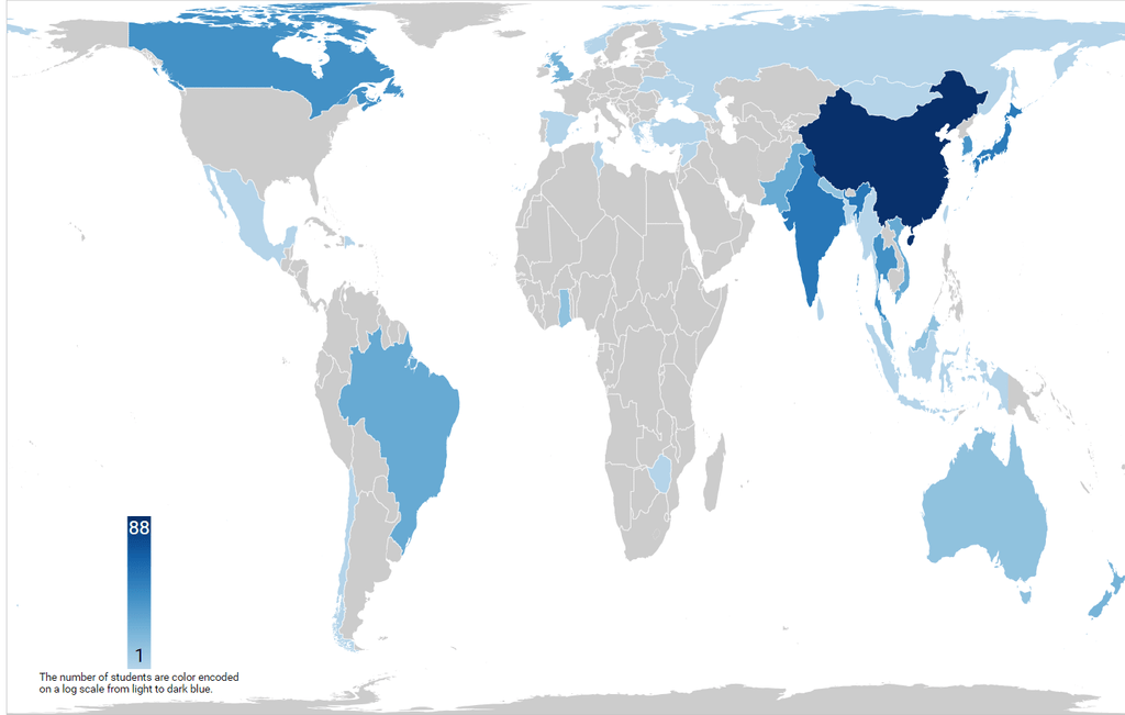
All in all, this was a great learning experience in which I learned visualization techniques, and the advantages of different map projections. It was also a great way for me to contribute to the international and intercultural community at Carleton. I am currently figuring out a way to place this visualization on the OIIL website, and the map should be accessible soon.