
Together with my intrepid colleague Sarah Calhoun, I tried out the new Riddle Mia This app at the Minneapolis Institute of Art (MIA). The app is designed by Samantha Porter and Colin McFadden (both employed at the University of Minnesota’s Liberal Arts and Technology Innovation Services) along with collaborators from GLITCH, a “community driven arts and education center for emerging game makers,” and was released on Sept. 14, 2018. It’s available for free download on the Google Play Store and the Apple App Store.
This won’t be a clue-by-clue discussion of the experience (how boring!), but rather will highlight a couple clues to point to some broader points about crafting place-based experiences that employ augmented reality (AR).
What’s in a Clue?

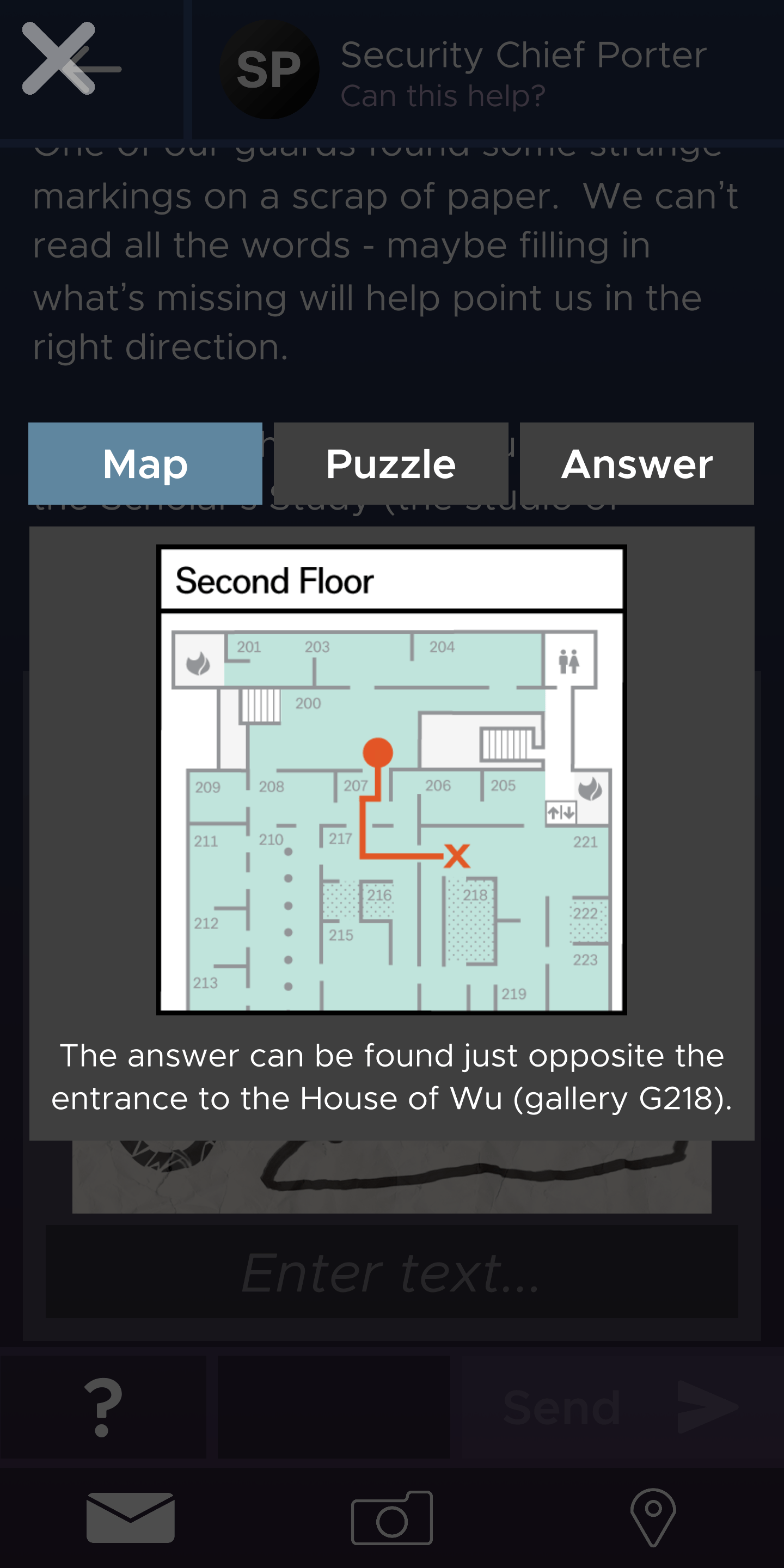
The clues are delivered via a text/email type message through the app, with a body of text giving the main part of the clue. The envelope button takes users to the full list of unlocked clues, and the camera opens up your phone’s camera for the clues that include AR aspects (which is maybe half of the total clues). The point opens the official museum map with floorplans for the 2nd and 3rd floors, which are the relevant floors for the app.
The “?” opens a menu of 3 additional options: Map, Puzzle, and Answer. The Map tab opens a selection of the museum gallery map with a line drawing showing where to go for the next clue. The Puzzle tab often gives you the actual information you need to complete the clue, eg. look for this kind of thing. The Answer tab gives the full answer.
My greatest challenge with the app and the overall experience was the structure of the clues. I know, I know, the puzzle aspect is part of the fun! But, I found the ways the clues were written confusing at times because of either word choice or how the clue text was parsed into the sections of the app. For example, for almost every clue there didn’t seem to be a consistent approach to what information landed in the main clue message and what was included in the Puzzle section. I would have preferred having all the information for the puzzle clue on 1 screen and then toggling over to the Map and Answer on another page, more clearly parsing the clues from the solutions in the interface. More signposting in the clues around when to use the camera and when an AR element was going to factor in would also have been welcome.
Direction and Scale Matters
We successfully completed the game in the estimated time of 1 hour. That hour was dedicated almost entirely to moving through the clues, which encompassed 2 floors and numerous galleries.
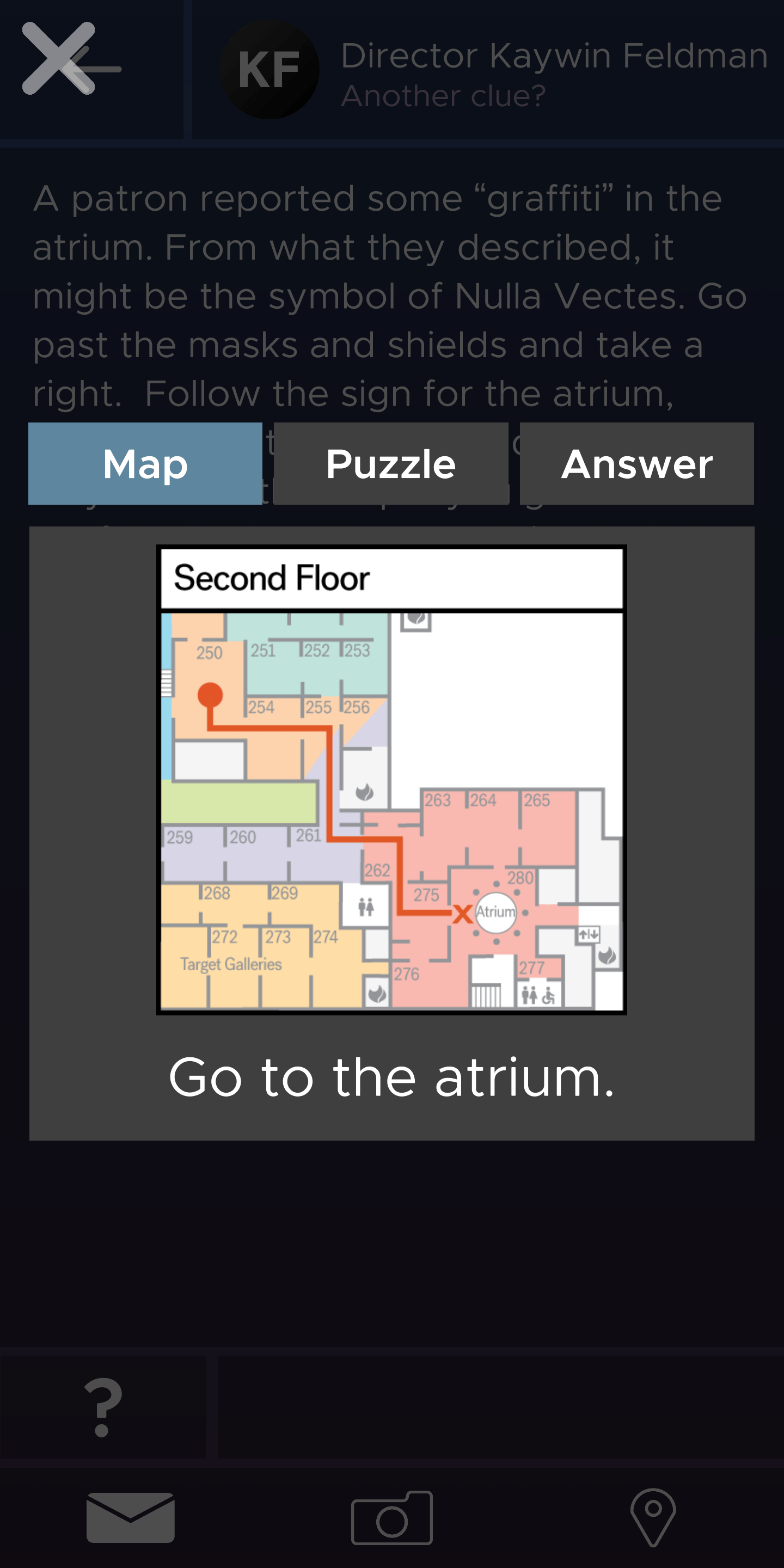
From the user perspective, I would suggest some ways to flag distance and movement through spaces between clues. The slices of map shown with each clue aren’t accompanied with a scale for estimated travel time. The graffiti clue is the clearest example of this: it suggests that the object is either on the 2nd or 3rd floor and has a considerable amount of travel time from origin to endpoint, including the level change and in our experience winding around some exhibit construction.
Takeaways
To be sure, the ambition of the app is one of its strengths as is the desire to expose users to a wide swatch of art styles, media, and artists. It moves users through MIA’s rich collections and I thoroughly enjoyed zipping through galleries that I had never ventured through before. A group of young people were also participating in the game and were about 4 clues “behind” so it was fun to hear snippets of their time working through the clues.
As I think about how to take inspiration from RiddleMIAThis, I’m pondering the issue of scale. One wish I have for a future version of the RiddleMIAThis (or other comparable museum gallery app) would be different “levels,” each one focused on 1 floor and/or 1 particular set of galleries, moving users from object to object and room to room on a smaller scale and around a particular theme or iconography. A week or so later, I’m hard pressed to think of a cohesive through-line for the art we saw, and the educator in me is always interested in those ways that technology can open up or reinforce teachable moments around the content.
Add a comment