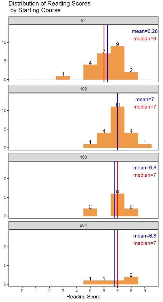
The language department requested for an analysis and visualization of the data on fifty-nine 204-level students and would like to know how their starting course (101, 102, 103, or 204) affect these students’ language ability scores. In response to this request, I created histograms to display the score distributions by ability (speaking, listening, reading, and writing) and then faceted each histogram by the starting course to compare these distributions vertically. Basically, the scores are grouped by “ability” and “starting course” and then plotted in histograms. The median and the mean of each group are represented by a vertical red line and a vertical blue line respectively. However, the number of observations is a bit too small to tell the difference between these distributions. Most distributions have too much variability and the median is not a very good measure to compare them.
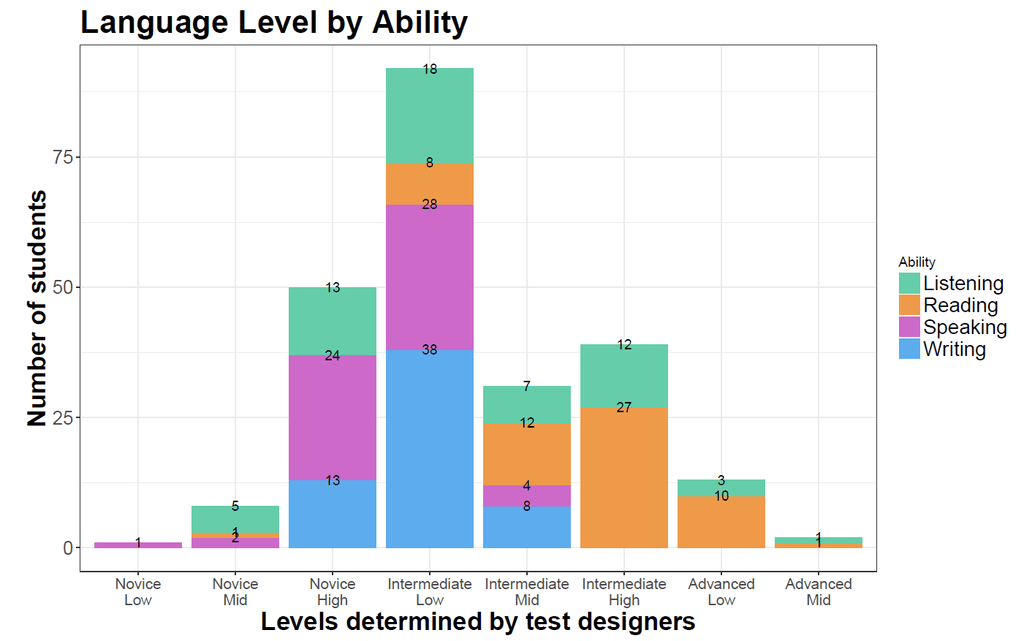
Another request is to interpret these students’ levels (Novice, Intermediate, or Advanced)set by the test designer. I created a stacked barplot to display the number of students in each language level, as they requested. I also annotated each bar segment with numeric values and distinguished each language ability by color.