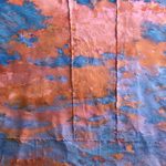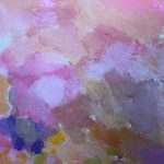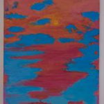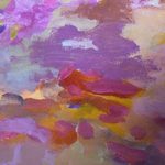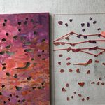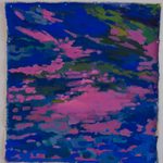
At the head of my comps process, I focused my work on the subject of pink skies. Looking at images of fairly similar pink sky-scapes, I envisioned a series of paintings that acted as windows, each looking up into a cloudy, magenta sunset. Though the images would be abstracted (saturated to an unreal extent, brushstrokes made visible), these works ultimately would depict forms recognizable as skies.
My generation has focused on pink, reclaimed and championed it for feminist causes. It’s been shoehorned in as the color of an age, resulting in a color, dubbed Millennial Pink, that has come to represent the knee-jerk reaction the modern consumer has to this color. Furthermore, though a good sunset can be universally enjoyable, I think skies are for some reason particularly fashionable to this age bracket—on a really good sunset day, it’s not uncommon to see photos of practically the same image of the sky scattered across Instagram grids and stories. In response, companies have answered with attention-grabbing ploys that appeal to this aesthetic—ad campaigns set against pink skies, makeup that promises “rosy cloud-like gradients” in blushes and eyeshadows.
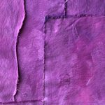
The pink sky has been become trendy; that is to say, perhaps I am just following the crowd. But as I’ve worked with the color, I’ve also wondered if my attraction to pink is partially due to the fact that I’m a woman, that my focus on it has been a subconscious draw, coded to move towards the traditionally feminine. I considered what it meant that I often treated the canvas like fabric, sewing and snipping alongside painting, and whether my comfort in these crafts arose from the my proficiency in the traditionally feminine tasks of mending, skills that my own grandmother passed down to me like a kind of family heirloom; though my focus was not necessarily consciously on womanhood, it presented in the work.
It was hard for me, furthermore, to not think about the environment as I constantly looked at images of the sky. Pink and magenta in sunsets are colors, to me, that represent a form of anxiety, specifically anxiety surrounding the climate and its visible deterioration. Pink, after all, is a dulled form of the aggressive, bloody red, a canary in a coal mine in a sky painted with these colors. It’s been hard for me to see sunsets the same way after learning that good sunsets are a marker of a declining atmosphere—that a view I once cherished at the end of each day is a result of a choking environment. I became obsessed with waste in the studio, saving everything—old paint, scraps of canvas, little bits of yarn and thread. These waste products began to accumulate, and I incorporated them into paintings or turned them into paintings themselves; I reanimated byproducts to create products. I wonder what it would look like if I could save every scrap and use and reuse it, until there was no waste leftover.
Finally, I’ve grappled with the emotional content of the sunset. Every day this winter, I’ve left the studio right as the sun has set in order to take images to reference in my works. I’ve found peace in the constancy of this ritual, in knowing that though my future as a winter term senior at Carleton is completely hazy, I always can find the repetition of the sun setting each day. I often find myself relating to these clouds’ endless drifting, to their limbless, untethered lives—it is challenging to not see myself in these aimless forms. On a more intimately personal level, this body of work represents my understanding of myself at this moment, this unconscious personhood embodied in this material. In turn, my practice this winter has been a practice of this acknowledging this loss of directionality, and considering it to be a kind of freedom instead, opening the door to both intended and unintended events. (View Beatrice’s website.)
— Beatrice Crow ’20